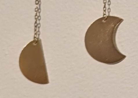
Looks innocuous enough at first glance right? Let’s zoom in on the problem:

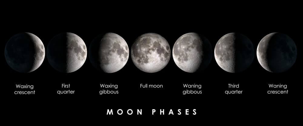
These don’t go together. If the semicircle on the left is correct, then this is showing moon phases, and the symbol on the right should be of a gibbous moon:

If the cookie-with-a-bite-taken-out in the right is correct, then this is showing an eclipse, and the symbol on the left should be of a 50% partial eclipse:

It drives me crazy every time I look at it.


Why on earth would they add a drop shadow while also having a semi white background? I want to find the original designer and squeeze a tube of super glue up their nostrils