Stupid article needs a before and after comparison.
Instead it has way too many ads.
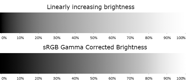
“It’s a bit technical,” begins Birdwell, "but the simple version is that graphics cards at the time always stored RGB textures and even displayed everything as non linear intensities, meaning that an 8 bit RGB value of 128 encodes a pixel that’s about 22% as bright as a value of 255, but the graphics hardware was doing lighting calculations as though everything was linear.
“The net result was that lighting always looked off. If you were trying to shade something that was curved, the dimming due to the surface angle aiming away from the light source would get darker way too quickly. Just like the example above, something that was supposed to end up looking 50% as bright as full intensity ended up looking only 22% as bright on the display. It looked very unnatural, instead of a nice curve everything was shaded way too extreme, rounded shapes looked oddly exaggerated and there wasn’t any way to get things to work in the general case.”
This should have been easy enough to illustrate.
Edit: Here is a greyscale illustration of a similar phenomenon:

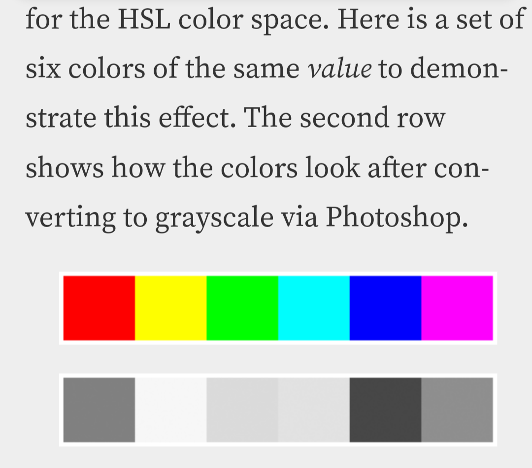
From https://www.odelama.com/photo/Developing-a-RAW-Photo-by-hand/Of course in reality it get a bit more complex when we perceive colors as having different brightness too:

From https://www.vis4.net/blog/avoid-equidistant-hsv-colors/This is amazing! I wish there was something akin to Lemmy Gold! Lemmy give it to ya!
EDIT I’ve posted this comment to bestoflemmy
Lemmy Gold you say?

I’m pretty sure you just won comment of the year! This is great and very helpful.
The latter is solved by better colorspaces, like OKLAB.
It’s amazing how PC Gamer are able to spin lenghty articles out of a couple of sentences from the Half-Life 2 20th Anniversary documentary. It’s the third one so far according to my own count.
Future publishing is unfortunately circling the drain right now, they recently canned a load of other brands that had been running for decades
They will not stop milking it until they’ve retold the entire documentary article by article
Regardless of the criticism on this article, you do have to give credits for the writer actually reaching out to Birdwell, and doing at least some investigative journalism.
deleted by creator
TLDR: sRGB.
For more complex errors in rendering assumptions, consider roughness. Lambertian lighting assumes surfaces are isotropic, i.e., the same from all directions. Brightness is the cosine of the angle to the light source. It’s why a lot of old renders look like smooth plastic. To my knowledge, Oren-Nayar was the first model to get diffuse brightness right, by looking more like chalk.
Reminds me of how frequently folks get color blending wrong (using linear blending results in darker colors). Or also volume sliders (using a linear scale results in much stronger volume changes near supposedly-silent volumes).
It just looks/sounds vaguely right and then no one ever questions it…
I’d suggest everyone to just watch the documentary instead of getting a catchy headline every other day blowing everything out of proportion.


