We reached the point (some time ago) where the save icon being a floppy disk makes absolutely no sense to anyone born after a certain time. We could choose a more modern media format and use an icon of that instead, but we would run into the same problem once that media becomes obsolete.
What is a good icon for the function of saving something that can easily be understood by anyone regardless of language or the march of time?
Edit: I know it’s not really an answerable question and is hard but the question is what would you come up with if tasks to design an icon. Given the constraints of the question, what are your best shots at coming up with something that fills the requirements and why do you thing it would work?
Down arrow pointing to a horizontal line.
You mean the scroll lock?
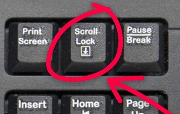
Yeah similar to that.
 ?
?
Are you going for just updating? If so, I’d leave it alone. Culturally it’s ubiquitous and doesn’t require changing.
If you’re thinking more along the lines of a save version of the whole “how do we ensure future people know nuclear waste resides within” then you’re gonna run into the same problems they do, symbols change meaning over time. But if I had to pick something that may be obvious to most people, my vote is a scribe and a pen. Most cultures have writing, most cultures with writing save information by writing it down. There are problems, obviously, but if you gotta pick one, that’s my vote until I hear a better suggestion.
And for what it’s worth, with the nuclear waste sitch, my vote first the atomic priesthood
How are there so many people ITT who genuinely don’t even understand what OP is asking and are arguing about something else completely that they thought up in their head like whether we should do away with the floppy icon because it confuses people now or if their youngsters know what a floppy is or if they do or if there’s a better icon to us now that can represent saving.
None of those are anything to do with OP really.
What OP is asking is if in 10000 years the next human civilization after our collapse that has no concept of computers and probably no electricity or industry nor potentially any grasp on our language or alphabet stumbles upon a functioning computer from our civilization, how do we tell them which button is the save button, when all shared symbolic context has been lost?
Consider the same question but for radioactive waste, how do we ward off potential future pre-industrial human civilizations from our nuclear waste sites to stop them dying to radiation poisoning for possibly tens of thousands of years until they develop an understanding of radiation and the equipment to measure it? Well, something like this maybe:
https://en.m.wikipedia.org/wiki/Long-term_nuclear_waste_warning_messages
Though maybe given this thread, we should instead be considering how to convey very simple abstract questions to the pre-industrial people on lemmy.world instead, especially when it appears they have only a rudimentary, GPT2-esque grasp on language.
k
This is not a place of honor, no honored dead is interred here.

Now I want to see the original sign.

Thanks!
I am also very perplexed by the responses in this whole thread. These are very basic drills that are also done in design based classes. It’s just a thought experiment.
I was gonna fight you because “or if there’s a better icon to us now that can represent saving.” Is a reasonable interpretation of what OP said.
But then I continued to read more comments and wow people just like… Explaining the floppy disk is wild.
You’re asking for an abstract indicator of a concept. You might as well be trying to draw ‘dignity’.
Everything else will become obsolete with time, and that’s not necessarily a bad thing. We have countless icons that have long since been separated from their original meanings. The need for it to be intuitive is when the concept is new, not as it changes.
Yeah you’re right, but I think it will be interesting to hear what people come up with. It’s similar to the nuclear waste warnings. Wikipedia Nuclear Waste Warnings
I would merge the idea of saving and bookmarking, because basically they mean “I want to be able to retrieve this”
☆ (unsaved)
★ (saved)
As a symbol, since the humanity is traveling, the stars are used to find what they are looking for or find it back (typically the North Star). And I’m pretty sure it will stay meaningful for a galactic civilisation.
I like this. Many apps are moving away from save altogether and just automatically save for you, even my local, no-cloud apps auto save when any change is detected. A bookmark for easy retrieval makes sense.
Assuming people still know what a folder is, the most obvious would be a folder with an arrow going into it, like:
 or
or

I know I’m wrong for thinking this but it looks too much like open to me.
Almost none of our symbols make sense and are disconnected from their origin. That’s a good thing. Without detachment of the signs from their reference we can’t have abstract thought and language. The letter D comes from an icon for fish. But it went from indexical reference to icon, to symbol. And then we changed its shape over time to what it is today, and some people started using it for the alveolar plosive. The same has happened for every single symbol we recognize and use, alphabet or not. It’s all arbitrary and it doesn’t matter if we don’t use actual floppy disks anymore.
This is all true but given the charge of creating a new icon that would be the “most recognizable” as save to the most people the first time they see it, what would that look like. The question is impossible to answer with a single thing as it’s too vast and everything becomes meaningless eventually. But given everything we know of languages, the brain, how we perceive things, what would be a better icon we could design?
You can’t design a better icon. That’s not how symbolism works. The most recognizable symbol for save is the one we are using now. As designing something new, by default, it would not be recognized by anyone but the designer since use defines meaning. Until it is used it won’t be recognized by anyone.
Edit: like, think of the play icon and its meaning in media control. It was born as an indicator of the direction a reel to reel tape player was moving. It still holds that meaning for digital streaming today despite the virtual extinction of tape players. Its use defines its meaning, detached from its origin and despite the obsolescence of its reference.
Not necessarily. I can see an icon with some randomly-sized vertical lines and think of rain. Or an icon might have a mountain peak silhouhette that generates a random mountain peak. Symbolism doesn’t work in the sense we can’t just design something but I’d argue we could probably come up with something that is at least indicative of saving to people regardless of language. Obviously the floppy fills that for now but if we could go back and drive the adoption of the icon, what icon could we create that would most indicate saving to people regardless of technology.
(I understand there isn’t a correct answer to this, just wanted to read people’s thoughts on ideas)
A friend was a design teacher and he taught me that design uses existing symbolism and iconography. But you can’t control what people will ultimately use your design for. The babadook for example, was a monster intended to cause fear in a horror movie. However, a clerical error by Netflix and an over imaginative tumblr user, turned it into a queer icon that is now widely recognized on internet culture. Of course you can sort of imbue intent and predict use of design to some extent, but humans have an arbitrary side that makes it hard to say something would be a better icon for an abstract concept.
There is no correct icon, the floppy disk is at least popular enough to be used essentially forever
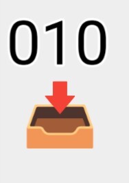
Alternatives would be making an SVG that mocks a HDD, or an open drawer with an arrow pointing in
For long term (1000 years) I think an open drawer is best especially with an arrow. It suggests putting something in, loading can be the inverse
So people used to store stuff in physical space like drawers? You mean if they needed something they had to physically go there and get it out of something else? Man, early humans were crazy.
Seems pretty easy…
You need an icon of a paper with text on it, an arrow pointing from the paper down to a larger box.
A recycle bin?

I like it! No need to know the language or anything. Things collect in basins like rain in bowl-shaped rocks so even without our current level of technology it would still have some indication of saving/gathering.
Thanks. Maybe a bit cryptic. Maybe add a couple dots to indicate stuff is being added and removed?
And is there any way to underline the fact that it’s MY bowl that’s being taken from and added to? Is it necessary? I dunno. Mulling required.
How about something like that? Symbolises data to device.
Maybe it’s just me but this looks like we’re putting it somewhere to forget. Like junk lol
that’s an in/outbox for paper documents.
Yeah, I just used what icon was handy. I mean if you were to do a more serious attempt,I’d draw it more like a concrete box, myself. Or more specifically concrete slots that line up with the numbers, driving home the point that it is a more permanent solution.
This is what I was thinking of, but no binary and just a square cardboard box with the flaps open.
Just an arrow pointing into a box.
I think this assumes no knowledge and transcends culture and tech.
An AI with a billion samples to draw from might deliver the collective unconsciousness visual you’re looking for.
Just keep using the disk icon.
Just because the original reference is outdated doesn’t mean it’s useless; the symbolism carries over. Changing it to the sake of future-proofing makes no sense because everybody already understands it now, and that knowledge will carry forward into the future. It has become the standard, even if it makes no sense, it even if it never made sense.
Horsepower is still used to refer to engine strength, even though nobody uses horses. Qwerty is still the keyboard default even though it’s not optional, because typewriters had settled on that standard ages ago. The human skull symbol is commonly used as a shorthand to indicate a substance is poisonous, because it has been for a long time. Even the term “dial” when referring to phone calls is still commonly used, even though nobody but your great-grandmother still even owns a rotary phone.
Tldr; If it ain’t broke, don’t fix it.
A hammer and chisel with a stone slate… some combination of that
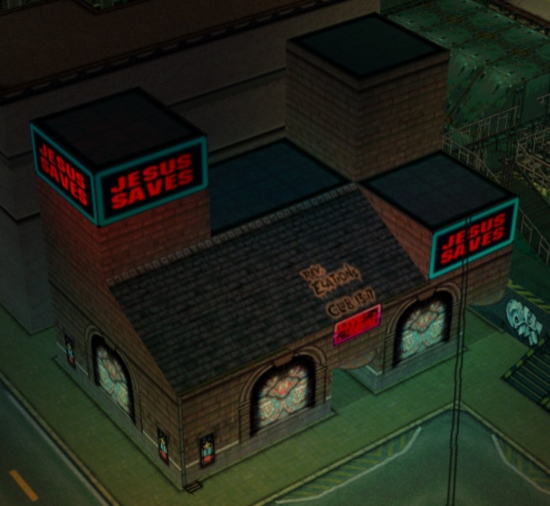
GTA2 save point.
“Halleluja, another soul saved”!
Spot on 😁