It’s a reflection of the far away road.
- 1 Post
- 50 Comments
Joined 1 year ago
Cake day: June 16th, 2023
You are not logged in. If you use a Fediverse account that is able to follow users, you can follow this user.
The windows repeat several times.
That’s called a reflect.
A reflect of a distant light source, that’s why it’s extremely similar.
That’s called a lens filter (or photoshop).
Please stop calling that something is AI generated, you obviously don’t know how to tell if it is.
This image was made at least before 2020
That’s called a reflection.

 81·22 days ago
I don’t know about the UX, but if you want peoples to use your app, it need to look nice.
If only it didn’t looked like a 20 year old software.
 3·1 month ago
Of course, I don’t understand why people think it’s “unecessary”.
Do they never do exploratory work and do thing they are uncomfortable with ?
It’s a tool, if i’m in a codebase I know well, it’s often pretty useless.
But I started writing some python, I’m a python noob, copilot is a gigantic productivity booster.
I browsed author own codebase and the first thing I saw is 150 lines of C# reimplementing functions available in the .NET standard lib.
An LLM that propose autocompletion for whole line/function.
the most recent Cloudflare drama.
It was made up by a shitty illegal crypto casino:
https://news.ycombinator.com/item?id=41091144They’ve been known to fuck customers before but I can’t really find specific examples.
Of course you can’t find specific examples because they are known to be great with customers.
I shouldn’t comment just after waking up.
Instead of changing the symbol, we can ask the unicode committee to put the current fediverse symbol in the unicode.
If you look at the code of one of the “malicious code”, it hit a … local IP, not a remote one.
Fake news headline. There is no virus installed on millions of computer.
An extension typosquatting an extension with million of install managed to be installed a few hundred of times.
 1·11 months ago
It isn’t. EDF have been recently nationalized.
The fact you call it “search results being subpar” tell me you never used the big top search bar labeled “Type
/to search”.
You can’t make an interface that everyone will understand, there will always be a percentage of user who will be lost.
If you used the top search bar, there was always this tab selection.
The looks changed a few month ago, but the featureset was visually the same.
I mean what view do you even get in this case ?
The code tab, shows… code ?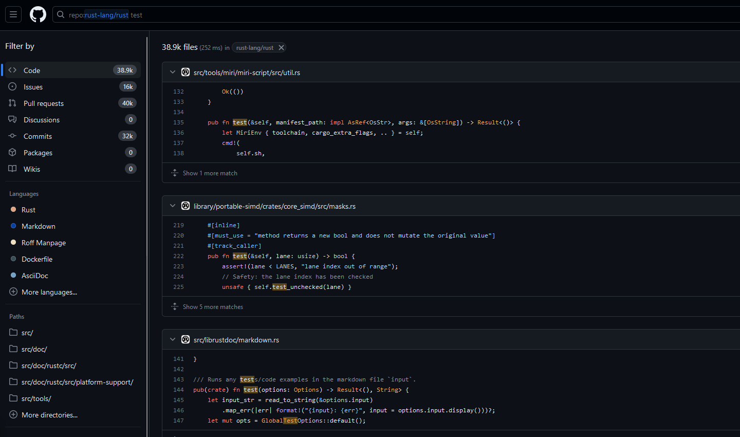
I was talking about the 3 blues one.
And if the image is fake, then what is it ? AI generated ?