Original question text by @[email protected]
What are the modern design trends you hate most? Feel free to rant! Mine are:
- Physical buttons are out of fashion, now EVERYTHING must have a touch screen instead! Especially if it makes the appliance more inconvenient to use. Like having to press a flimsy touch screen ten times to scroll through a washing machine’s programs instead of just turning a physical knob and pressing a physical start button.
- Every website looks like it’s made for a phone and was vomited by the same app in slightly different flavors of vomit.
- Actually EVERYTHING looks like it’s made for a phone… Like what’s the deal with all those hamburger menus on DESKTOP apps? Please just put a regular menu and same me some pointless clicking, it’s not like you’re lacking screen space. I especially hate that those menus can’t be opened from the keyboard like regular menus.
The installed appification of everything riddled with trackers when a web browser + site will do. Dead simple minimalistic UI that a toddler can figure out how to use. Every product is designed to account for the lowest common denominators of human intelligence which encourages brain rot instead of making the tech illiterate feel pressured to actually learn. Now we have entire generations of idiots who feel entitled to all the pleasant cnvinnce of advanced technology but no desire to accept responsibility to learn how to use it properly.
A society built entirely on dead simple convinence and instant gratification is one that fosters the destruction of individual critical thinking skills and mental robustness to troubleshoot/adapt when encountering a problem.
You hit it spot on. That lazy attitude pisses me off so much I will hardly help people with tech anymore. I know like maybe 1 person who actually has the want to learn, the rest are so lazy they wont even get off the couch to watch a DVD they already own so they stream it with ads instead. Infuriating. And the people using gibbity are 10000 times worse. Idiots. I think those of us who want to learn and enjoy it are going to be gone in 10 years. Replaced by total corpo idiocy.
Minimalism.
It’s everywhere from company logos, to fast food interior design, and now the vexillology community swears by minimalist flag designs.
The open floor plan was the beginning of our demise.
Almighty Profit Motive™ forbid we proles find any semblance of joy in our lives and - gasp - interact with the physical world around us in any meaningful and engaged way!
No, we must be deprived of all dopamine outside of our designated corporate brainrot centers.
Every appliance, monitor, speaker, clock, really anything that plugs in has to have a blue LED.
Got a modem from the cable company installed in my bedroom, the indicator lights were bright enough to read by.
The problem I have isn’t so much that they’re blue, but that they’re bright. I have flashlights with modes dimmer than the average modern indicator LED.
Get some blue-tack and blind all those blinkers!
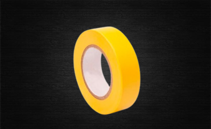
The lights have use, I cover them with black electrical tape to dim them sufficiently
Colors. Society has been getting more monochrome for years. And now black and white houses are all over.
My house is a reddish brown with a green metal roof. My cars are black, red, and yellow, and I do everything I can to make sure that I am surrounded by at least some kind of light and color at all times.
If I was dating a girl and I found out that she was a sad beige mom, that would be the end of the relationship.
I am about to close on my first house and it has white aluminum siding. I want to replace the siding, but what color do I choose? Also the roof is red metal.
any color you want. Your local paint store can can mix any of tens of thousand different colors while you wait. Paint is cheap - spend the extra cost for their best paint and it is still cheap.
make sure you don’t move where a hoa puts limits on you - and tell your realtor not to waste your time on those places.
Paint is cheap
I mean, compared to gold bars I guess. (Guess who’s painting their house)
Red and green go well together. Perhaps a natural foresty color.
Yeah, like a Christmas house. Sounds very tasteful.
Oh man yeah, everything’s monochrome. Grey houses, grey fences, white cars, grey window frames, grey kitchens. Everything is so dull.
Houses are usually white to reflect heat and because white doesn’t burn out.
Every electronic item whether it be a hot water kettle, air conditioner or an UPS backup in my camper, even my electric toothbrush has to make a noise, a bing or beep when either the things starts, changes phase or finishes.
This button “style.” WTF even is this? It’s objectively and functionally terrible.

Also McDonald’s brutalism. But then, I’m happy not to eat there.
Worse than the squircle button design?
- the height of the “Home” button isn’t even the same as the rest of the other buttons
- no spacing between the buttons
- the element surrounding those buttons don’t even contain buttons properly
- lack of proper spacing between the buttons and the containing element
I am not wanting vast swathes of white space between elements, but if you’re giving them background colors so that you indicate where the user can click (and thus interact with the button) at least have some decency to give them some breathing room. Sure, when hovering you can add an effect such that it either changes color, brightness, or gains a glowy border or what have you, but most of the time none of those elements are hovered! You’d be seeing them all crammed together like sardines in a tube!!
Oh, and I got so riled up that I didn’t even address that out of place “ExtraCare scan in store” element. Why is it even covering the “Discover” text? Was the foreground some interactive element that just popped up?
Sorry. The more I try to make sense of the UI, the more I think rounded/squircle buttons are the least of the problems there.
Your point are all 100% spot on. Also why would the “Scan in store” thing pop up when I’m in my bedroom?
Also why would the “Scan in store” thing pop up when I’m in my bedroom?
When I try using geolocation for my desktop or my phone connected to my home wifi, it is as if I were in the same building as my ISPs offices (or maybe servers?) I suppose it’s the same over there. Maybe there’s a CVS near (same building?) your ISPs offices.
Someone on the design team heard that squircles are the latest shit and put zero thought into implementing them.
How was this person hired onto a design team?! You can’t even read the full button text because it’s cut off for no reason!!
Apartment complex websites that photoshop (outright lie) about what the apartment is like and you’re not allowed to see the actual place before renting (current tenant is still there, or the manager/owner just doesn’t want you to see even if it’s empty). And - there’s so much competition for apartments in the area you either sign the lease sight-unseen or you live in your car.
I’ve done OK in some of these. None were what the website pics and descriptions offered, but they were still OK. Some others, though, turned out to be absolute broken down dumps. And every single one of these places have great online reviews. Imagine that.
time to get a cheap toy drone and start taking the pictures yourself
Farmhouse modern
Also anything that looks like it comes from Kirkland’s, because there’s a good bit of overlap:

Dark themed apps and websites. Vertical video. Blurry photos and videos when it’s done for “artistic reasons”.
Rounded corners everywhere
IMO that actually looks nice most of the time.
The “toggle switch”. In the past we had these checkboxes. A black square. If it had a x or check mark in it, it meant this option was active, otherwise not.
Now we have these fancy toggle switches. If it’s on the left side, is it on or off? What if it’s blue, or grey?
Left is always off, right is on. Generally a toggle switch indicates an immediate change, whereas a checkbox can have a delayed effect. Colours are optional but generally a colour indicates the switch is turned on.
left is definetly not always off. i am curious what you mean by delayed effect that cannot also affect a checkbox. especially if some cookie settings now havetoggles with three options, each one in a different color, some just slide between the rightmosg and middle option etc.
no matter what you say, this is not intuitive, a checkbox is! if there are more than two options, choose another ui element. foem over function is way too common for (at least my) comfort nowadays
Scrollbars that are impossible.to use because they auto.minimize , and you have to get them just right to slide.
I hate single page apps that force you to click on a post to see comments, and don’t let you open them in a new tab.
Everybody everywhere in the whole wide world is wearing blundstone boots!
Heatpumps in front of houses.


